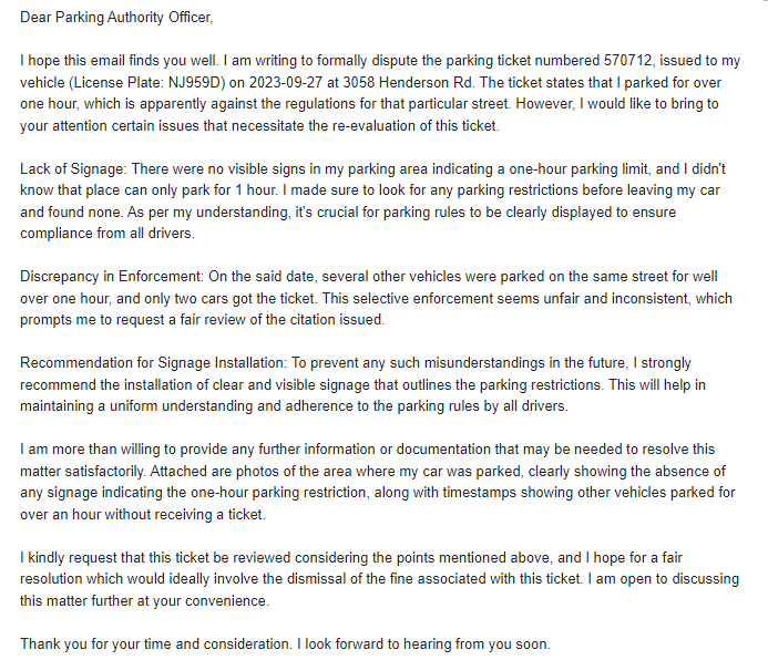
AI applications have become powerful tools in study and work. I used ChatGPT in many activities like grammar improvements and language translating, but my most notable experience was when I received a parking ticket for exceeding a 1-hour parking limit, although I was certain that there were no signs indicating such a 1-hour restriction. To address this ticket, I turned to ChatGPT to help me draft a dispute email to the District of Oak Bay.
The email written with the assistance of ChatGPT was exceptional in its clarity and logic. It presented my argument in a structured manner, using precise language and incorporating clear evidence to support my case. This well-constructed email played a crucial role in my successful dispute over the parking ticket, demonstrating the practical utility of AI in navigating everyday challenges.
So far, ChatGPT is the primary AI application I have experience with. Its ability to understand and generate natural language has proven extremely useful, particularly in situations requiring detailed written communication.
(Above pictures are the email I used to send district of Oak Bay)
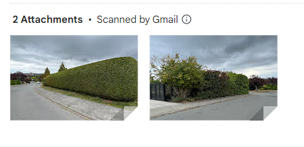
Use ChatGPT to generate Graph
It has been observed that when a photograph is inputted into ChatGPT with a request to generate a graph based on the visual data, the tool does not produce a graph. This is due to ChatGPT’s design, which primarily processes and responds to textual input rather than visual data. However, when provided with textual descriptions or information, ChatGPT demonstrates the capability to generate text-based graphs. This underscores ChatGPT’s proficiency in handling and responding to textual data while highlighting its limitations in direct image processing.
I first inputted a photo of my cat and asked ChatGPT to generate a similar graph. Obiously, It failed.
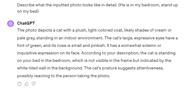
Therefore, I inputted the photo of my cat and asked ChatGPT to describe what the photo looks like, then use the description to generate a cat’s graph.
Finally, I got the following graph,
While ChatGPT can generate images based on textual descriptions, there is still room for improvement in terms of accuracy as specific characteristics might not always be fully captured compared to the original photograph.
(OpenAI, 2023)
Pros and Cons of AI
Pros:
AI has significantly contributed to the convenience of human life. For instance, AI’s application in healthcare has already benefited the public; it can analyze vast amounts of data in a short time, accurately diagnose conditions, and identify the best treatment plans. In the realm of autonomous driving, AI not only alleviates human burden but also substantially reduces the rate of accidents.
AI propels societal advancement. With the application of AI, industries have seen a significant increase in production efficiency, liberating humans from repetitive, menial tasks and high-risk occupations. This liberation affords people more freedom of choice, allowing them to devote their energy to more meaningful pursuits.
Cons:
As AI robots become more widespread, industries that rely on physical labor are at risk of experiencing large-scale unemployment. AI robots do not make mistakes, do not tire, do not require rest, and do not need wages, making them fully capable of performing most tasks.
The advancement of AI poses a potential grave threat to human society, and we must be vigilant about the rise of AI. Stephen Hawking once said, “The development of full AI could spell the end of the human race.” Without active intervention and guidance in the development of AI, it might completely replace human society, rendering humans obsolete in an AI-dominated world.
Reference
OpenAI. (2023, Nov. 24). [ChatGPT response to generate the graph]. https://chat.openai.com/
In this lesson, we will explore the economic housing models of homeless people, explaining the choices individuals make when faced with limited funds and government housing policies. The importance of this topic lies in its ability to demonstrate how well-intentioned policies might inadvertently contribute to the problem of homelessness, suggesting that improvements in housing policies could provide practical solutions to homeless people. We will also present a real-world study conducted by the University of British Columbia, which gives cash directly to homeless people. This research provides evidence of the effectiveness of such cash transfers in reducing days being homelessness and achieving government-spent savings. However, it also notes the limitations in improving overall well-being. Overall, we first provide a theoretical framework to understand the choices and policies affecting homelessness, and then offer empirical evidence on how cash transfers would mitigate the issue of homelessness.
Lesson Objectives
By the end of this lesson you will be able to:
Understand the Economic Model of Homelessness, and know how this model explains the choices made by homeless individuals, such as the trade-off between housing and other necessities.
Understand the unintended consequences of well-meaning housing policies such as minimum dwelling size requirements.
Recognize the function and limitations of charitable shelters in providing temporary relief to homeless individuals.
Know the outcomes of a real-world study conducted by UBC that used cash transfers as a potential solution to homelessness.
Understand the concept of cash transfers as a dignified method of aid for those experiencing homelessness.
Propose ideas and recommendations based on the lesson’s content for addressing homelessness more effectively through policy changes and social interventions.
For further analysis of the homelessness housing policies, we first denoted:
q = housing consumption, which also is q = y/p – c/p
c = consumption of everything else
p = price per unit of housing
y = income of the low-income household
Budget constraint is c+pq = y
We start analyzing the model with the following graph,
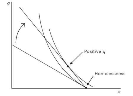
The homeless person maximizes utility subject to a budget constraint, thus the highest indifference curve must touch budget line at bottom, where q=0. We can also see from the graph that the steep indifference curve indicated the consumer is very reluctant to give up c. They require a lot of q to give up a little c.
The reluctance is mainly due to alcohol, drugs, and mental illness, indicating the housing consumption is a much lower priority compared to getting enough food.
Let’s consider how a Proportional Rent Subsidy Program will affect the homelessness.
Under the Proportional Rent Subsidy Program, the government pays a potion of the household’s rent. However, the consumers have the same income to devote to c if they did not spend on housing, so the intercept at y does not change. Thus the budget constraint rotates upward. Now we can see the highest indifference curve is tangent to the budget constraint at a point where q>0.
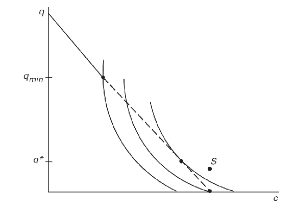
What if there are limitations stipulate by housing regulations such as minimum dwelling size requirements?
When housing regulations require a min q, the dashed line is not attainable. They only gives the homeless person two options, consume qmin or q=0. The second option is on a higher indifference curve, so consumer choose to be homeless.
What if a charitable organization provide shelter to address homelessness? If they provide shelter at zero cost, the consumer can consume point S on the above figure.
Application
Learners can engage in policy development by using their understanding of economic models and empirical research to advocate for changes in housing regulations, accommodating the housing needs of low-income individuals.
Learners can organize workshops or create informational campaigns that highlight successful outcomes such as direct financial assistance.
Reflection
What are the advantages and disadvantages of provding shelter to address homeless people? Why do some of the homelessness not use charitable shelters even the cost is zero?
How do economic models help us understand the decision-making process of individuals who are homeless?
What are the potential risks and benefits of reducing housing regulations, such as minimum dwelling sizes?
What are the long-term social costs of not addressing the affordability of housing?
How might the findings from the UBC cash transfer study influence future policies and programs aimed at reducing homelessness?
How can we ensure that well-intentioned assistance programs do not have unintended negative effects on the homeless population?
To Do List
Answer one or two questions in reflection.
Review the economic model of homelessness, and write down the reason for the rotation of indifference curves when the PRS program implemented to homelessness.
Present how government policies might inadvertently contribute to homelessness.
Compare and contrast the theoretical models discussed in the content with the empirical findings in the UBC study.
Discuss how new insights into housing supply might influence future policies or personal perspectives.
I would like to use Merrill’s Principles of Instruction to design a lesson around the research result of visualization of 3D time series data on a 2D map to effectively show the spread of a virus. The lesson will be centered around a real-world problem – understanding and visualizing the spread of a virus. This is particularly relevant in the context of global health crises like the COVID-19 pandemic. It addresses the need for an understanding of epidemiological data.
I used Python to write a function to show how 3D time series data can be plotted on a 2D map. Though Python isn’t interactive, we can design our own 3D time series function to show the visualizations of data.
I would also like to create tutorial videos showing the Python scripting process and how it translates data into visualization. Summarizing key steps to control the 3D time series data function is extremely important to process real-world data sets.
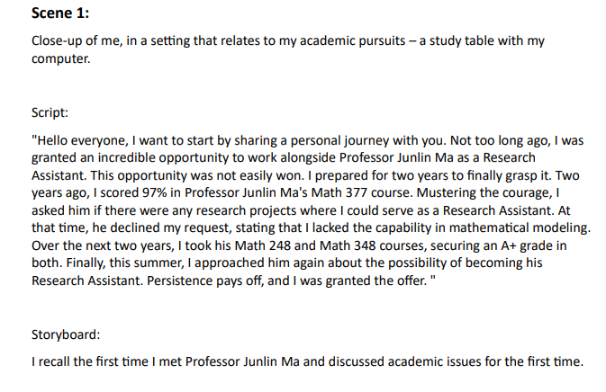
Welcome to my video guide on the 3D Time Series Visualization on 2D Map research project. As someone deeply entrenched in this research, I recognized the profound value it brings to the academic and practical realms, but I also understood that conveying this complicated concept is equally critical. Hence, this video was conceived with a distinct purpose in mind.
Our project purpose is to bring clarity to the global pandemic scenario by visually representing the spread of communicable diseases, such as COVID-19 cases. Using an innovative approach, we’ve developed a 3D time series representation overlaid on a 2D map. This visualization technique allows viewers to instantly grasp both the geographical spread and temporal progression of the virus. By transforming raw data into a visually intuitive format, I hope to offer policymakers, healthcare professionals, and the public a tool to better understand and respond to the evolving pandemic landscape.
The video started with sharing my own story – how I gained the opportunity to become the Research Assistant of Professor Junlin Ma and venture into this research. This part aims to inspire budding researchers about the avenues open to them to get the opportunity.
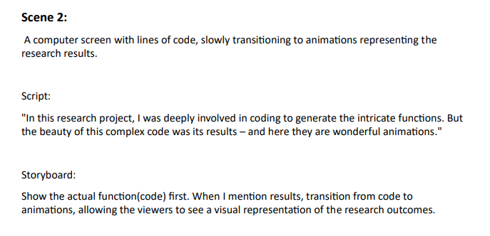
Our animation function is a marvel in itself, but for users to harness its full potential, they must understand each component. I provide a detailed breakdown of each argument of the animation function, ensuring that our audiences not only know ‘how’ to use it but also ‘why’ each component exists. A function is only as good as the data it processes. Thus, I also claimed the datasets required, ensuring users use the function most effectively.
Seeing is Believing, thus I showcased the research results, demonstrating the visual marvels achieved with our method. The tangible results of our hard work highlighted the function’s utility. This video aims to educate, by understanding our research and its practical application, viewers will recognize the vast benefits of our approach.
Applied Principles
So far, we delved deep into various principles that enhance the effectiveness of multimedia learning. In my video, I’ve consciously integrated several of the Cognitive Load Theory to optimize the learning experience. CLT was at the forefront of my design considerations. Considering our working memory has limitations, it’s crucial to present material in a manner that doesn’t overburden the learner.
Like my first blog, I first incorporated the redundancy principle, I ensured that information wasn’t presented in a redundant manner, thus avoiding unnecessary duplication which can confuse learners. I presented the research project in a very straightforward way. Besides, I also applied the signaling principle, Key information was pointed out effectively in my video, ensuring that learners could easily discern the core content. Voice and Image Principles are necessary. By using my own voice, I endeavored to establish a personal connection with the learners. The germane cognitive load is a challenge. I incorporated this principle by offering content that was challenging but understandable in my video, to keep a long-term retention of the content for learners.
I also incorporated storytelling techniques into my video. After seeing the inspiring TED presentations, I’ve consciously woven in several of these storytelling techniques to make my video resonate more deeply with the audience.
I applied the Tell a Personal Story to humanize the research, making it more accessible and emotionally resonant. Particularly, I told my audience I used to spend a week researching the wrong topic. For the Show. Don’t Tell technique, I recognized that the subject of 3D time series can be quite abstract, so I showed the research results directly to illustrate what is 3D time series. This helped to conquer the problem of overwhelming the audience with technical jargon. Lastly, by applying the End with a Positive Takeaway technique, I concluded the project presentation on a positive note emphasizing its potential benefits and implications for the future. This provided a concise and memorable summary that could spark further discussions and interest in the topic.
In conclusion, by incorporating these principles and techniques, I believe I’ve created a learning method that is both efficient and engaging, aligning well with the objectives of the teaching purpose.
Challenging
I had several challenges when I created the video for the 3D time series project. Video editing should be the biggest challenge for this time. Ensuring smooth transitions and a seamless narrative flow was a daunting task. Editing is time-consuming because achieving a professional look requires meticulous attention to detail. Meanwhile, keeping the video concise while ensuring all key points were covered was another hurdle.
Besides, my video content has high complexity, and the academic nature of the 3D time series data concept meant that the content could be dry and difficult for a general audience to grasp. Therefore, given the theoretical nature of the topic, it was challenging to design the video in a manner that would retain the audience’s interest, which required a lot of brainstorming and creativity.
In sum, while creating the video was a valuable experience, it required significant effort, time, and creativity to ensure that the video was both informative and engaging.
Easy Parts
The video creation for the 3D time series project besides being challenging in many aspects, also had its easy parts.
I had spent nearly four months on this research, I was deeply familiar with the subject matter. This made it much simpler to decide what information to include and how to present it in the video. Furthermore, I knew precisely what I wanted to convey. This clear understanding helped streamline the production process from scripting to final edits, reducing the time and effort spent on revisions.
Another part is deciding on the theme was straightforward. I’ve always been eager to introduce this research project to a wider audience. This assignment provided the perfect platform, aligning with my intrinsic motivation. At the same time, my genuine interest in the topic undoubtedly made the entire process more enjoyable. When I’m passionate about what I’m sharing, it makes tasks feel less like work and more like sharing a part of myself.
Impovement for Next Video
To approach video capturing differently next time, I will definitely practice more on video editing. Since video editing was my biggest challenge, I consider investing time in learning more about the tools and techniques.
Also, since the content was academic and potentially hard for some to grasp, I will show a draft to someone unfamiliar with the topic to get feedback. Their feedback can help make the video more accessible and engaging for a general audience. To combat the academic nature of the content, I consider making my videos with interesting pictures, funny outfits, or exaggerated body movements. These can impress the audience and make it easier to understand the content.
‘Practice Makes Perfect’ was embedded in my mind for a long time, but I didn’t spend too much time to practice on my speaking in this video. The more familiar I become with my content and equipment, the smoother the recording process will be. I will also try to focus on the most compelling aspects of my study, simplifying complex topics, and passionately conveying my findings.
By addressing the challenges and leveraging the easy parts, my next video project will not only be smoother but also more engaging for my audience.
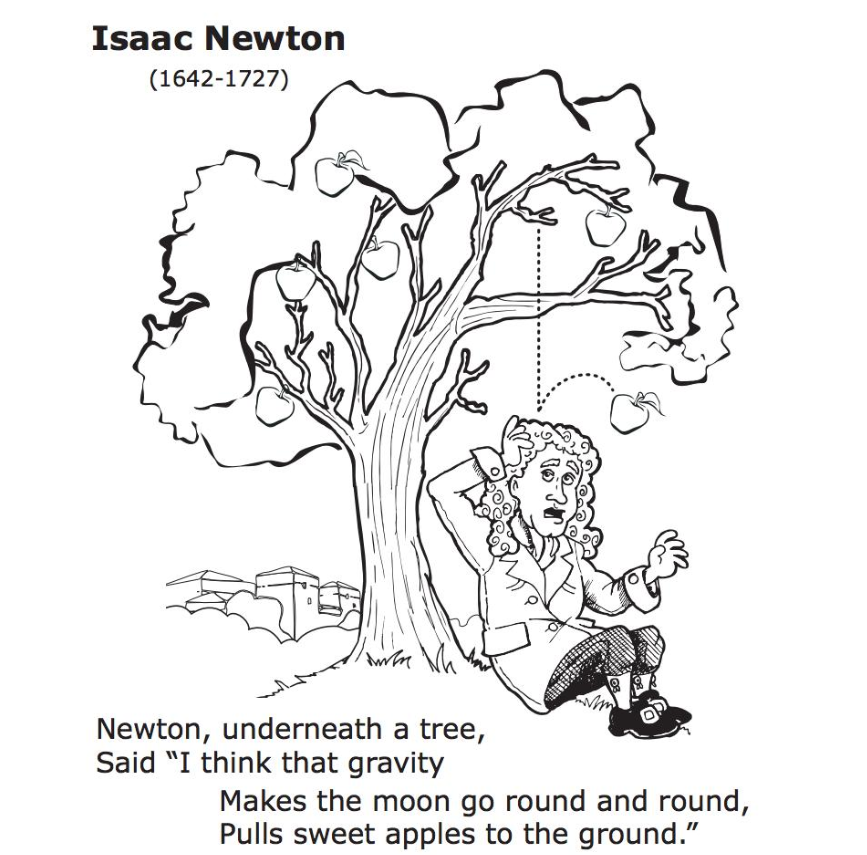
Sir Isaac Newton and the Falling Apple is one of the most famous stories in physics study, which brought me a meaningful learning experience. This well-known narrative tells how Newton was sitting under an apple tree, and an apple fell on his head, leading him to question why it fell straight down and not in any other direction. This simple observation and subsequent contemplation supposedly led him to formulate the laws of motion and the universal law of gravitation, Particularly, the story helped me to keep the First Law in mind, which tells people an object will remain at rest or in uniform motion in a straight line unless acted upon by an external force.
What made this story so impactful for me was its simplicity and the profound discovery. It showcased that great scientific revelations don’t necessarily come from complex experiments but can stem from normal observations if approached with a curious mind.
The story appealed to my visual sense, as I could easily picture the scene of Newton sitting under the apple tree. The tactile sensation of an apple hitting his head also made the story more vivid.
Looking back to the storytelling techniques reviewed this week, the Newton story clearly utilizes the power of visualization, with elements like the apple tree and the falling apple. It also taps into emotions – the surprise of the apple’s sudden drop. Finally, the story use ‘End with a positive takeaway’ techniques embodies the idea that monumental insights can be born from simple, everyday experiences, making the learning memorable and inspiring. The fact that such a transformative concept gravity was understood from such a basic observation, giving hope to learners like myself, that we may one day stumble upon our own apple.
7 Storytelling Techniques
In my video, I introduced my research experience on 3D Time Series Visualization on 2D Map. I have instinctively used ‘Immerse your audience in the story’, ‘Tell a personal story’, and ‘Show Don’t tell.’ storytelling techniques. I did this at the beginning of the research project story, introducing the background and drawing the audience into the narrative. I started by telling my audience why I wanted to do the research project and how I gained the research opportunity. This means creating an environment where listeners can visualize and feel the story as though they’re experiencing it firsthand. I used rich descriptive language and sensory details to paint a vivid picture of the day I was offered the research assistant position, allowing the audience to step into my story. By speaking from the heart to share my real-life example, I used emotions and reflections to connect on a personal level with the audience. Furthermore, I showed the audience my research results rather than just telling them. I showed the 3D time series cylinder moving on the 2D BC map, which shows the COVID-19 cases spread situation in BC, making my narratives more vivid and memorable.
However, I need to work more on creating suspense and building up to a S.T.A.R. moment. I should involve crafting my narrative in a way that keeps my audience eager to know what happens next, building tension and anticipation. For example, I should not tell my audience if the research sucessed or failed.In the future, I won’t reveal everything at once.I will give bits of information gradually to keep the audience curious. I should also create the “Something They’ll Always Remember” moment, leaving a lasting impression in my narrative.
All 7 Storytelling Techniques are crucial, once we successfully apply these techniques, we will be enhancing the depth and engagement of our stories, creating memorable narratives that resonate with our audience.
Creating Story by Using Twine
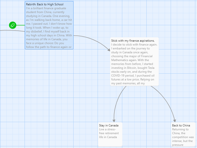
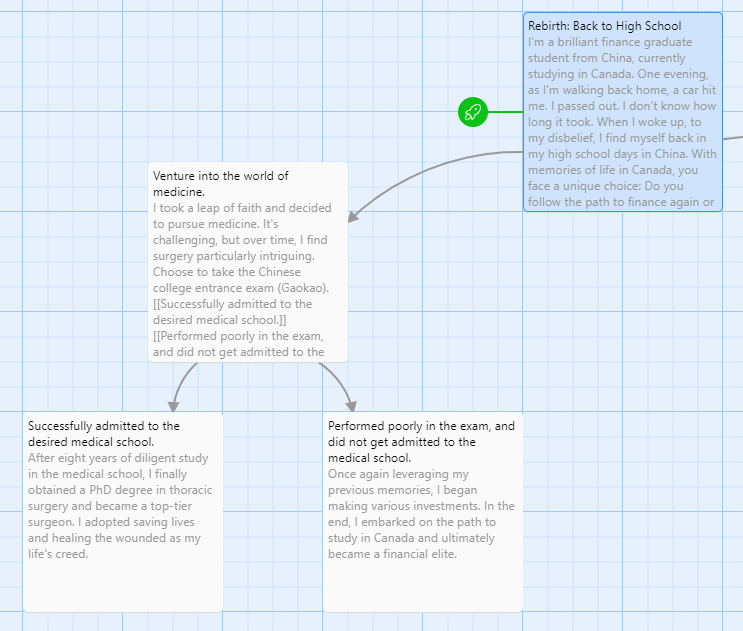
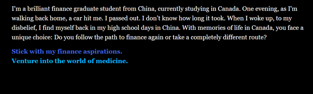
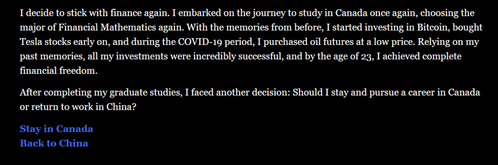
This is a science fiction story, telling a brilliant financial math graduate student from Canada who finds himself inexplicably transported back to his high school days in China. Presented with a rare second chance, he grapples with decisions that could redefine his destiny. Will he tread the familiar path or take an entirely different turn?
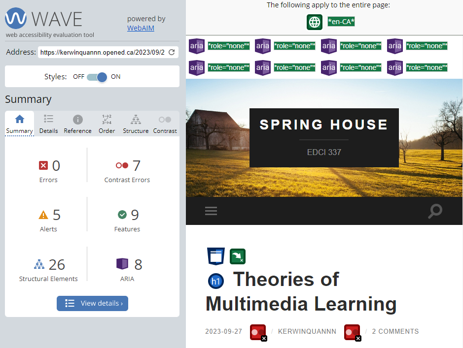
In the WAVE accessibility report, I discovered seven instances of very low contrast errors. This indicates that the background and text colors might be too similar, posing reading difficulties, particularly for individuals with visual impairments.
Among the five alerts, one pertained to a skipped heading level, suggesting an inconsistency in the sequence of heading levels. This can confuse screen reader users. Another alert highlighted redundant links that point to the same URL, which can be repetitive for screen reader users. The alert about the very small text was particularly concerning and, frankly, surprising. Text that is too diminutive poses readability challenges, especially for those with visual limitations.
Regarding features, images with null or empty alternative text might render them inaccessible to screen reader users.
Lastly, I noticed that all 8 ARIA attributes in my blog are set to role=”none”. I must confess, I’m not entirely sure how to handle ARIA attributes properly, but I’m committed to learning more about them.
Moving forward in my blogging journey, I will prioritize increasing text-background contrast and ensuring a consistent heading structure. Addressing the issue of small text is straightforward—I’ll adjust the font size for enhanced readability.
Inclusive Design in Multimedia and Learning
The digital age provides a vast array of opportunities to create and share information, particularly through multimedia. However, to guarantee that every individual can access, comprehend, and benefit from these resources, inclusive design becomes paramount.
From my perspective, there are three crucial principles for Inclusive Design: Recognize Exclusion, Solve for One, Extend to Many, and Learn from Diversity. Inclusive design necessitates not only an acknowledgment of biases but also an active effort to mitigate exclusion by pinpointing and addressing potential barriers. Furthermore, it’s crucial to engage with a diverse array of individuals, as they offer essential insights into adaptive tools and methodologies. By integrating these principles into media design, we ensure that our content resonates with a broader audience.
As we navigate the digital era, embracing inclusive design isn’t just a commendable choice, it’s imperative. Thus, when pondering the question, “What does inclusive design mean to you?”, it signifies molding a digital world where everyone, regardless of their abilities or backgrounds, feels acknowledged, understood, and appreciated.
I’ve never used a text-to-speech tool before. This assignment was my first experience using Chrome’s “Read Aloud” extension to browse blog content audibly. To my surprise, it significantly enhanced my content reading experience.
I was particularly attracted by the variety of voice options available, especially the regional accents like UK, USA, and Canadian English. The UK English voice adds an air of formality and sophistication to the text. It has a distinct rhythm that makes the content feel refined and polished. The US English voice is more neutral in its delivery and gives people an easy-going feel. It is direct and clear. On the other hand, the Canadian English voices seem like a blend of the previous two. It was friendly, almost conversational, yet retained an informative tone.
Interestingly, the sound I choose does affect my ability to absorb information. While the unique intonation of a British accent makes me focus more, but Canadian accent is ideal for long reading sessions because it’s more relaxed, simple, and clear.
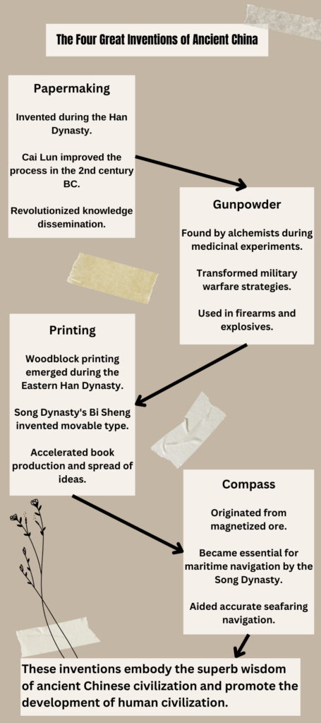
Infographics with Canva
When designing the infographic on the Four Great Inventions of Ancient China in Canva, I made use of the following principles. I ensured that the titles and subheadings for each invention were consistently aligned, following the Focus on Alignment. I also followed the Use Hierarchy to highlight the name of each invention with a bold and bigger font to differentiate it from the supporting text. Proximity was also applied, I grouped relevant pieces of information about each invention together for clarity. Lastly, I followed the Negative Space by ensuring there was enough space between each section for better readability.
For the elements of a ‘good infographic’, I first incorporated the Limited Colour Palette, I opted for a restrained color palette that is both eye-catching and relevant to the subject matter. Then I kept a uniform style for fonts, headings, and subheadings for Consistent Style Choices. I also ensured there was a balance of white space to avoid overwhelming the viewer. Furthermore, I used varying font sizes to create a hierarchy of information, guiding the viewer’s attention. I also considered ensuring that the designs are concise. It’s important that no part of the infographic feels too cluttered.
Using a template in Canva makes it easier to achieve a professional and cohesive look without much effort. However, templates can also be limiting in terms of creativity. It’s challenging to incorporate specific design elements to template if they don’t fit within the template’s constraints. So after I selected a template, I redesigned the infographic based on the theme of the four great inventions of ancient China and optimized the original template.
Intuitive and Surprising Principles of Cognitive Theory of Multimedia Learning
There is no doubt that the principles outlined in the Cognitive Theory of Multimedia Learning (CTML) help to bring an effective approach to designing instructional materials in a way that caters to the diverse cognitive processing capabilities of learners.
For me, the redundancy principle is the most intuitive one, because it aligns with the everyday understanding that repetition of the same information through multiple channels might not only be unnecessary but could also be distracting.
On the flip side, the Dual Coding Theory is a surprising and fascinating theory. It’s my first time knowing the existence of two separate but complementary systems in our brain dedicated to processing verbal and visual information. We can improve academics’ learning efficiency by enhancing the synergy between verbal and visual processing channels described by dual coding theory.
Successes and Challenges of Applying CTML
I successfully incorporated redundancy, coherence, and signaling principles in my screencast design, showcasing a clear understanding of minimizing extraneous cognitive load, thus allowing learners to focus on the essential content. My cognizance towards avoiding unnecessary text, staying on-topic, highlighting key information, and organizing material effectively is a strong foundation for designing effective multimedia learning screencasts.
I also employed the voice principle, by using my own voice for narration, which adds a personal touch. Additionally, I adhered to the image principle by not distracting the learners with irrelevant images to maintain focus on the learning material.
Germane cognitive load is indeed challenging as it requires a nuanced understanding of the learner’s capacity to accept new knowledge. It’s about striking a balance to ensure that the learning process is stimulating without being overwhelming. Applying the germane cognitive load may need to observe how well they grasp the material in the long-term study.
The personalization principle is also challenging. It’s about establishing a connection with the learner in a manner that feels natural and engaging, which requires some understanding of my audience and needs some practice to get right.
Audience
In my screencast, I chose to introduce the most significant traditional festival in China. The audience in my mind would be Canadian students who are unfamiliar with traditional Chinese culture. The audiences play a crucial role in how I design my multimedia materials, especially in the context of Mayer’s Cognitive Theory of Multimedia Learning.
Considering my audience’s unfamiliarity with traditional Chinese culture, it’s important to simplify the information to manage the intrinsic cognitive load. By choosing only one festival to focus on, I reduced the complexity and made the information more understandable
I also applied dual coding theory by utilizing visuals of celebrations, decorations, and traditional foods along with narration to convey the cultural richness and significance of the festival.
Since the majority of my audience has not been exposed to Chinese traditional festivals, I followed the segmenting principle the break down the information about each festival into small segments allowing for easier understanding. I first introduced the significance and status of each festival in China, then explored the origins of the festivals, and finally enhanced the audience’s understanding by introducing traditional foods, activities, and customs associated with these festivals.
Screencast: Chinese New Year
This screencast (by Zoom) shows the age-old traditions, delicious culinary delights, and lively festivities, aiming to offer Canadian students a captivating glimpse into China’s traditional ethos. let’s get to know the traditional festivities that continue to color the lives of billions of Chinese individuals across the globe.
Greetings and a warm welcome to Spring House, a place where whimsy meets wisdom, imaging where every corner is sprinkled with a bit of sights and sounds of spring. It’s a website named after my cat, Spring. Much like Spring’s gentle purrs and soft trots, this space aims to bring a sense of comfort, curiosity, and camaraderie.


Recent Comments