WAVE Accessibility Report
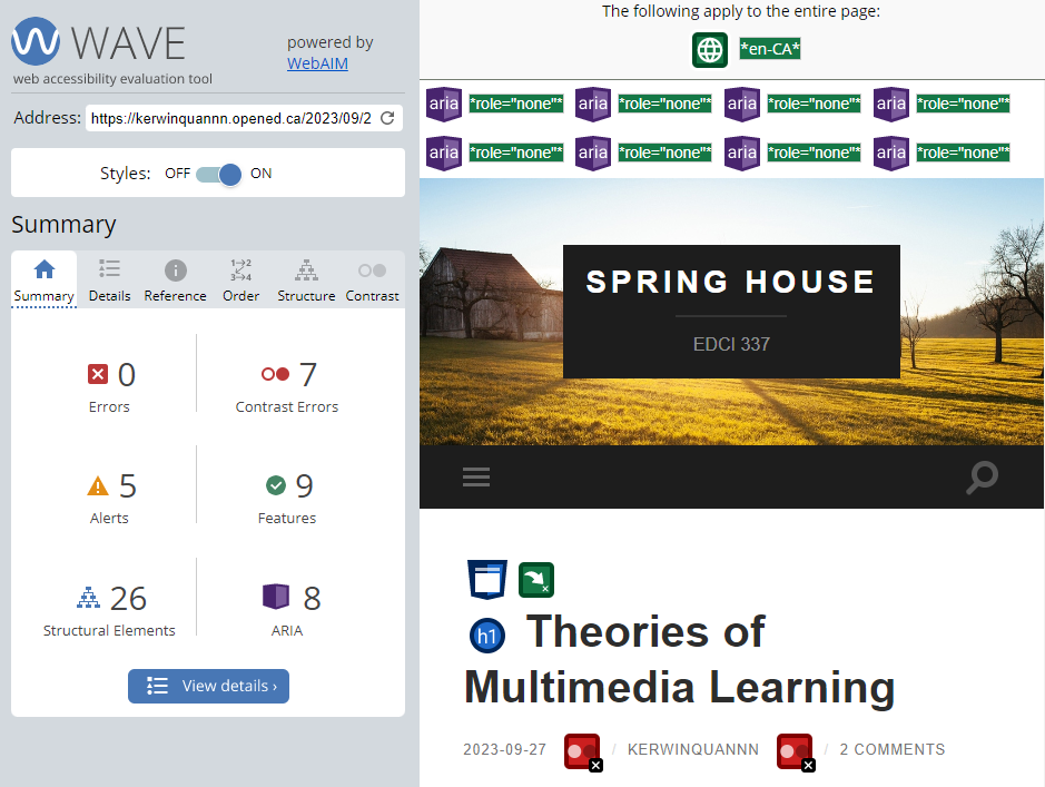
In the WAVE accessibility report, I discovered seven instances of very low contrast errors. This indicates that the background and text colors might be too similar, posing reading difficulties, particularly for individuals with visual impairments.
Among the five alerts, one pertained to a skipped heading level, suggesting an inconsistency in the sequence of heading levels. This can confuse screen reader users. Another alert highlighted redundant links that point to the same URL, which can be repetitive for screen reader users. The alert about the very small text was particularly concerning and, frankly, surprising. Text that is too diminutive poses readability challenges, especially for those with visual limitations.
Regarding features, images with null or empty alternative text might render them inaccessible to screen reader users.
Lastly, I noticed that all 8 ARIA attributes in my blog are set to role=”none”. I must confess, I’m not entirely sure how to handle ARIA attributes properly, but I’m committed to learning more about them.
Moving forward in my blogging journey, I will prioritize increasing text-background contrast and ensuring a consistent heading structure. Addressing the issue of small text is straightforward—I’ll adjust the font size for enhanced readability.
Inclusive Design in Multimedia and Learning
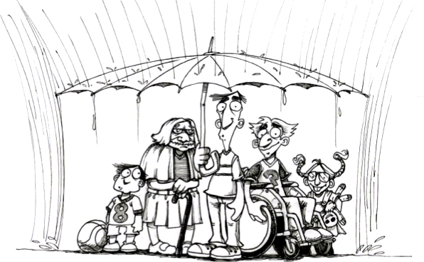
The digital age provides a vast array of opportunities to create and share information, particularly through multimedia. However, to guarantee that every individual can access, comprehend, and benefit from these resources, inclusive design becomes paramount.
From my perspective, there are three crucial principles for Inclusive Design: Recognize Exclusion, Solve for One, Extend to Many, and Learn from Diversity. Inclusive design necessitates not only an acknowledgment of biases but also an active effort to mitigate exclusion by pinpointing and addressing potential barriers. Furthermore, it’s crucial to engage with a diverse array of individuals, as they offer essential insights into adaptive tools and methodologies. By integrating these principles into media design, we ensure that our content resonates with a broader audience.
As we navigate the digital era, embracing inclusive design isn’t just a commendable choice, it’s imperative. Thus, when pondering the question, “What does inclusive design mean to you?”, it signifies molding a digital world where everyone, regardless of their abilities or backgrounds, feels acknowledged, understood, and appreciated.
Text to Speech/Screen Readers
Model 2: Accessibility and Equity
Blog 1: Theories of Multimedia Learning
I’ve never used a text-to-speech tool before. This assignment was my first experience using Chrome’s “Read Aloud” extension to browse blog content audibly. To my surprise, it significantly enhanced my content reading experience.
I was particularly attracted by the variety of voice options available, especially the regional accents like UK, USA, and Canadian English. The UK English voice adds an air of formality and sophistication to the text. It has a distinct rhythm that makes the content feel refined and polished. The US English voice is more neutral in its delivery and gives people an easy-going feel. It is direct and clear. On the other hand, the Canadian English voices seem like a blend of the previous two. It was friendly, almost conversational, yet retained an informative tone.
Interestingly, the sound I choose does affect my ability to absorb information. While the unique intonation of a British accent makes me focus more, but Canadian accent is ideal for long reading sessions because it’s more relaxed, simple, and clear.
Infographics with Canva
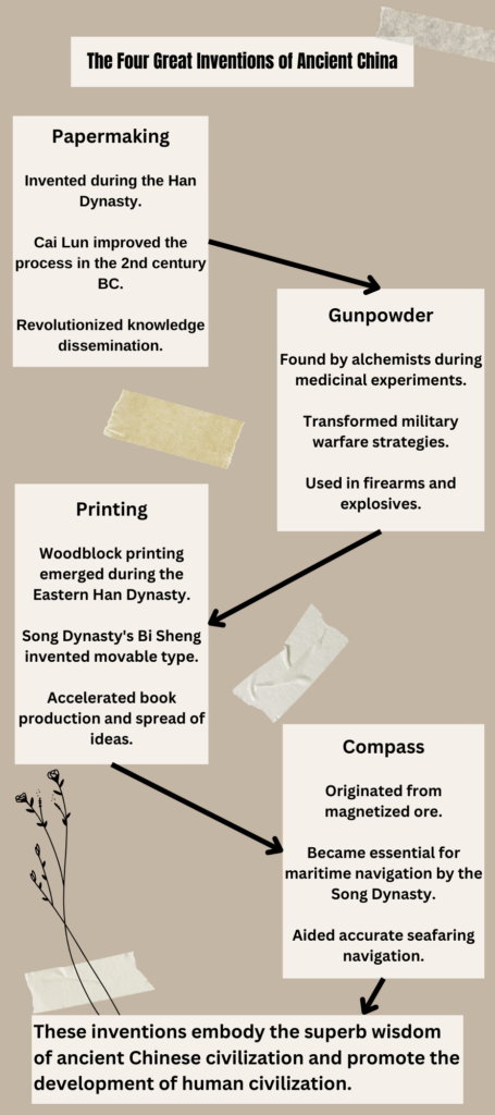
When designing the infographic on the Four Great Inventions of Ancient China in Canva, I made use of the following principles. I ensured that the titles and subheadings for each invention were consistently aligned, following the Focus on Alignment. I also followed the Use Hierarchy to highlight the name of each invention with a bold and bigger font to differentiate it from the supporting text. Proximity was also applied, I grouped relevant pieces of information about each invention together for clarity. Lastly, I followed the Negative Space by ensuring there was enough space between each section for better readability.
For the elements of a ‘good infographic’, I first incorporated the Limited Colour Palette, I opted for a restrained color palette that is both eye-catching and relevant to the subject matter. Then I kept a uniform style for fonts, headings, and subheadings for Consistent Style Choices. I also ensured there was a balance of white space to avoid overwhelming the viewer. Furthermore, I used varying font sizes to create a hierarchy of information, guiding the viewer’s attention. I also considered ensuring that the designs are concise. It’s important that no part of the infographic feels too cluttered.
Using a template in Canva makes it easier to achieve a professional and cohesive look without much effort. However, templates can also be limiting in terms of creativity. It’s challenging to incorporate specific design elements to template if they don’t fit within the template’s constraints. So after I selected a template, I redesigned the infographic based on the theme of the four great inventions of ancient China and optimized the original template.
Wow! I really like your view about the question:” What does inclusive design mean to you?”. Your discussion on this topic is in-depth, and I can’t agree more with your thoughts! Yes, when your design is making everyone to have the feeling of being acknowledged, understood, and appreciated, this design would definitely be an outstanding sample of inclusive designs. Also I like your infographic! The whole picture looks very straightforward, clear, and logical, I am able to tell exactly what you are talking about. Also I can see that you did not use too many colors in your infographic which implies that you had applied the principles about how to design an infographic to your product well! Nice work!